Plot dispersion trend and estimates for each cell type
Usage
# S4 method for class 'lucida'
plotDispEsts(object, cluster_ids = names(object), minDispersion = 0.001, ...)Value
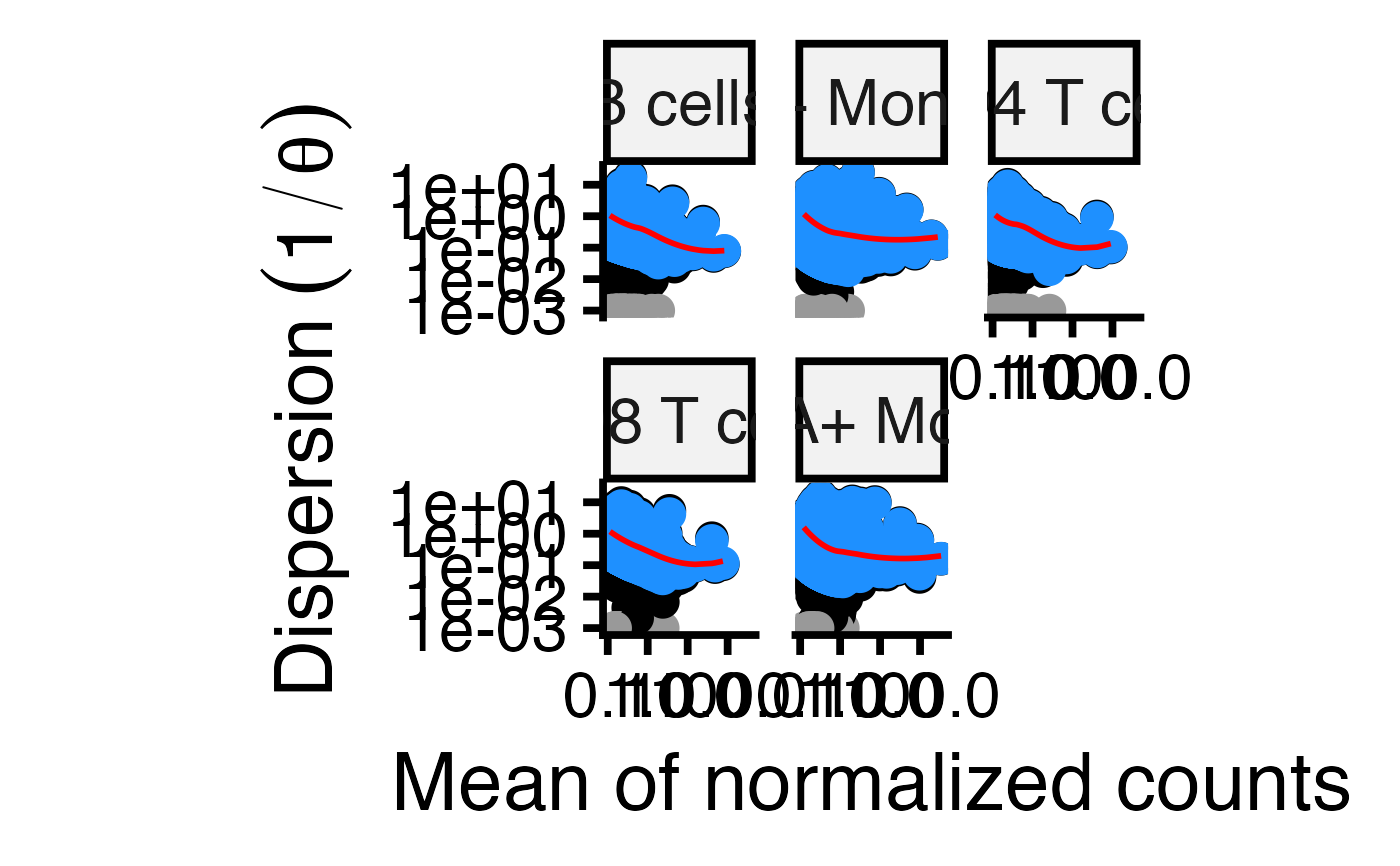
ggplot2 plot of 1/theta versus mean normalized counts for each for each gene and each cell type. Original values are shown in black, the trend line is shown in red, values after dispersion shrinkage are shown in blue. Grey points indicate dispersion outliers excluded from the trend.
Examples
library(SingleCellExperiment)

# Load example data
data(example_sce, package="muscat")
sce <- example_sce

# Compute library size for each cell
sce$libSize <- colSums(counts(sce))

# Specify regression formula and cell annotation
form <- ~ group_id
fit <- lucida(sce, form, "cluster_id", verbose=FALSE)
#> B cells
#> CD14+ Monocytes
#> CD4 T cells
#> CD8 T cells
#> FCGR3A+ Monocytes

# Plot the dispersion trend
plotDispEsts(fit)