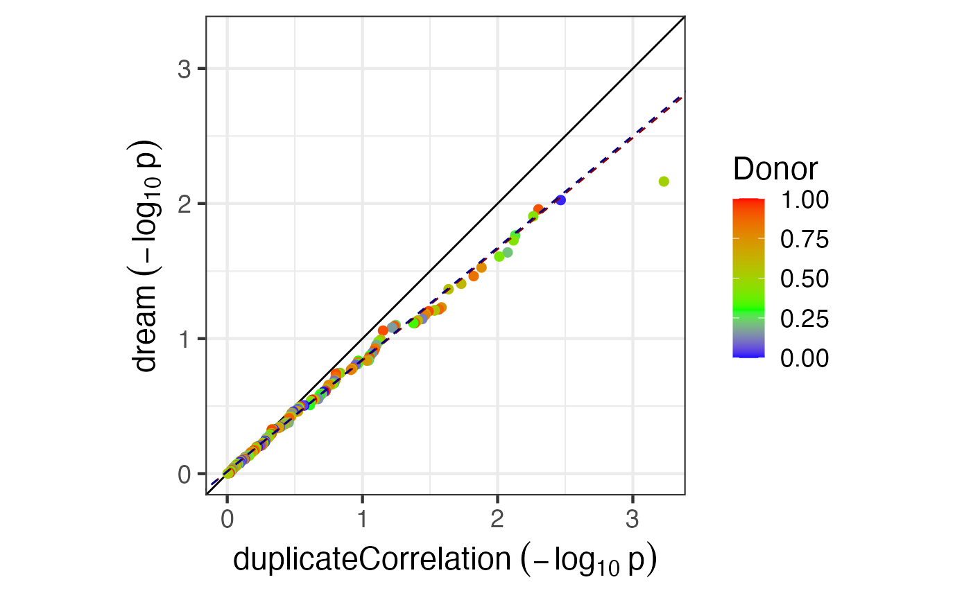
Plot -log10 p-values from two analyses and color based on donor component from variancePartition analysis
Arguments
- p1
p-value from first analysis
- p2
p-value from second analysis
- vpDonor
donor component for each gene from variancePartition analysis
- dupcorvalue
scalar donor component from duplicateCorrelation
- fraction
fraction of highest/lowest values to use for best fit lines
- xlabel
for x-axis
- ylabel
label for y-axis
Examples
# load library
# library(variancePartition)

library(BiocParallel)

# load simulated data:
# geneExpr: matrix of gene expression values
# info: information/metadata about each sample
data(varPartData)

# Perform very simple analysis for demonstration

# Analysis 1
form <- ~Batch
fit <- dream(geneExpr, form, info)
fit <- eBayes(fit)
res <- topTable(fit, number = Inf, coef = "Batch3")

# Analysis 2
form <- ~ Batch + (1 | Tissue)
fit2 <- dream(geneExpr, form, info)
res2 <- topTable(fit2, number = Inf, coef = "Batch3")

# Compare p-values
plotCompareP(res$P.Value, res2$P.Value, runif(nrow(res)), .3)
