Plot heatmap
Usage
plotHeatmap(
  x,
  genes = rownames(x),
  color = "darkblue",
  assays = colnames(x),
  useFillScale = TRUE
)

# S4 method for class 'cellSpecificityValues'
plotHeatmap(
  x,
  genes = rownames(x),
  color = "darkblue",
  assays = colnames(x),
  useFillScale = TRUE
)

# S4 method for class 'data.frame'
plotHeatmap(
  x,
  genes = rownames(x),
  color = "darkblue",
  assays = colnames(x),
  useFillScale = TRUE
)

# S4 method for class 'matrix'
plotHeatmap(
  x,
  genes = rownames(x),
  color = "darkblue",
  assays = colnames(x),
  useFillScale = TRUE
)Examples
library(muscat)
library(SingleCellExperiment)
data(example_sce)
# create pseudobulk for each sample and cell cluster
pb <- aggregateToPseudoBulk(example_sce,
assay = "counts",
cluster_id = "cluster_id",
sample_id = "sample_id",
verbose = FALSE
)
# Compute cell type specificity of each gene
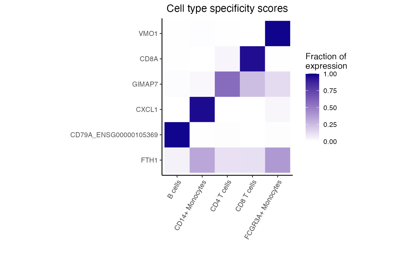
df <- cellTypeSpecificity(pb)
# For each cell type, get most specific gene
genes <- rownames(df)[apply(df, 2, which.max)]
# heatmap of 5 genes that are most cell type specific
dreamlet::plotHeatmap(df, genes = genes)